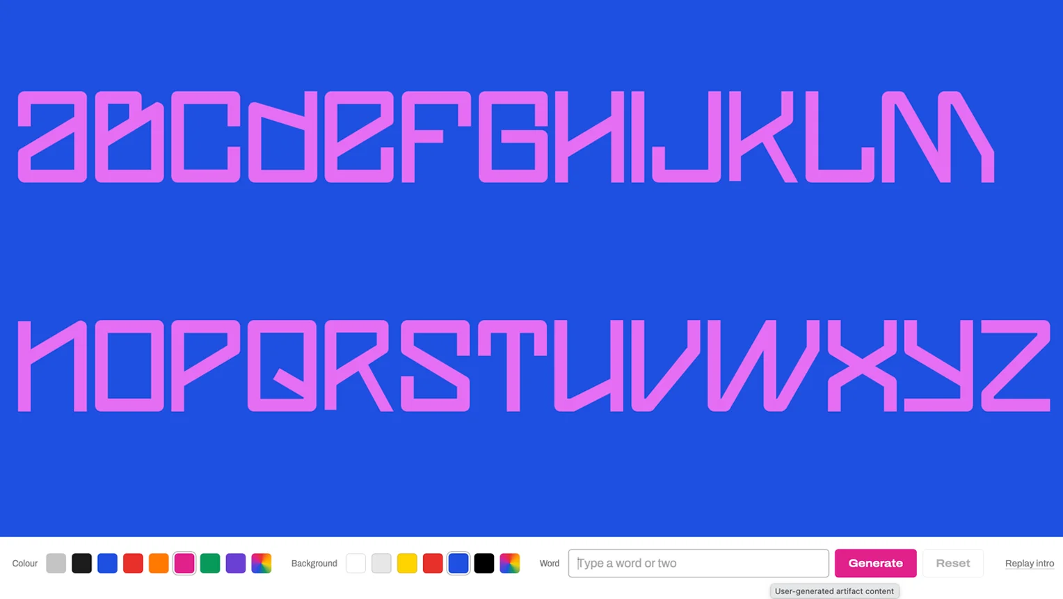
Coalition Alphabet Collider
I created the Coalition font for a logo I designed for John Ingham, an architect friend of mine. He had the strangest handwriting I'd ever seen, so I thought he'd be open to a logo using letters than were nearly unreadable. Coalition has its own weird logic. Some letters mirror each other (J,L)(M,W) or are just rotated 180 degrees (A,E) I like the combination of order and anarchy. John's logo consisted of his name constructed from transparent letters. It was interesting seeing the relationships between the letters when I was designing the logo and I always thought it would be nice to animate them. One bonus with the collider was seeing how the scambled words shown prior to them forming correctly are more unreadable than ever. The final words almost look normal.
The thinking
from the planningShow the relationship between the letterforms with movement and transparency. Prove that the Coalition font is actually readable by first showing how unreadable it can be. Challenge people to select colours and words.
- Motion follows the letterformsLetters only ever travel at 0, 45 and 90 degrees, giving us briefs glimpses of the relationship between the letterforms.
- Overlaps darkenLetters multiply where they cross on light backgrounds and screen on dark ones, so collisions read like overprinted ink.
- Spare letters leaveLetters not used in the words fly off the page before the letters slide into the correct word order.