ADA
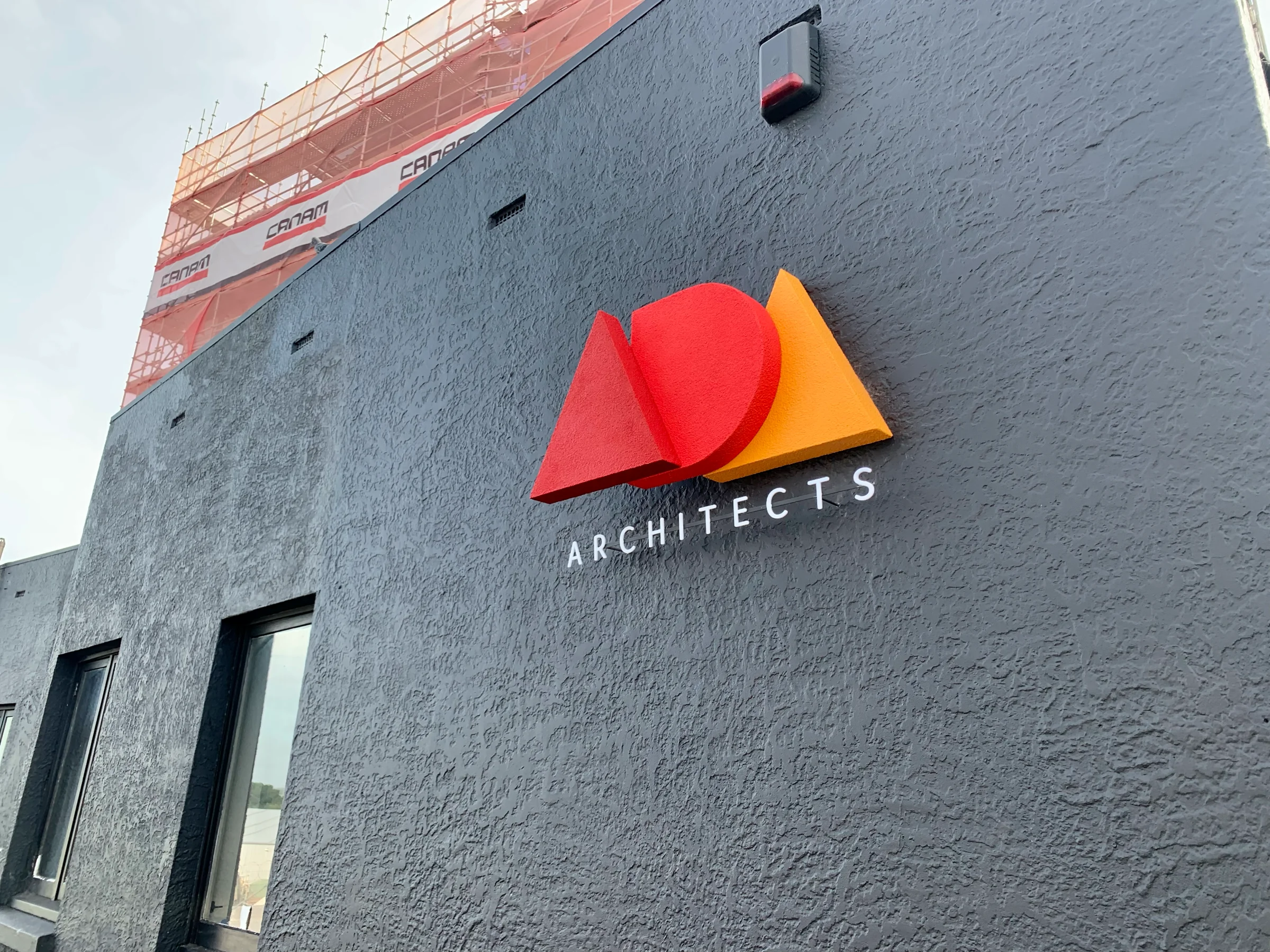
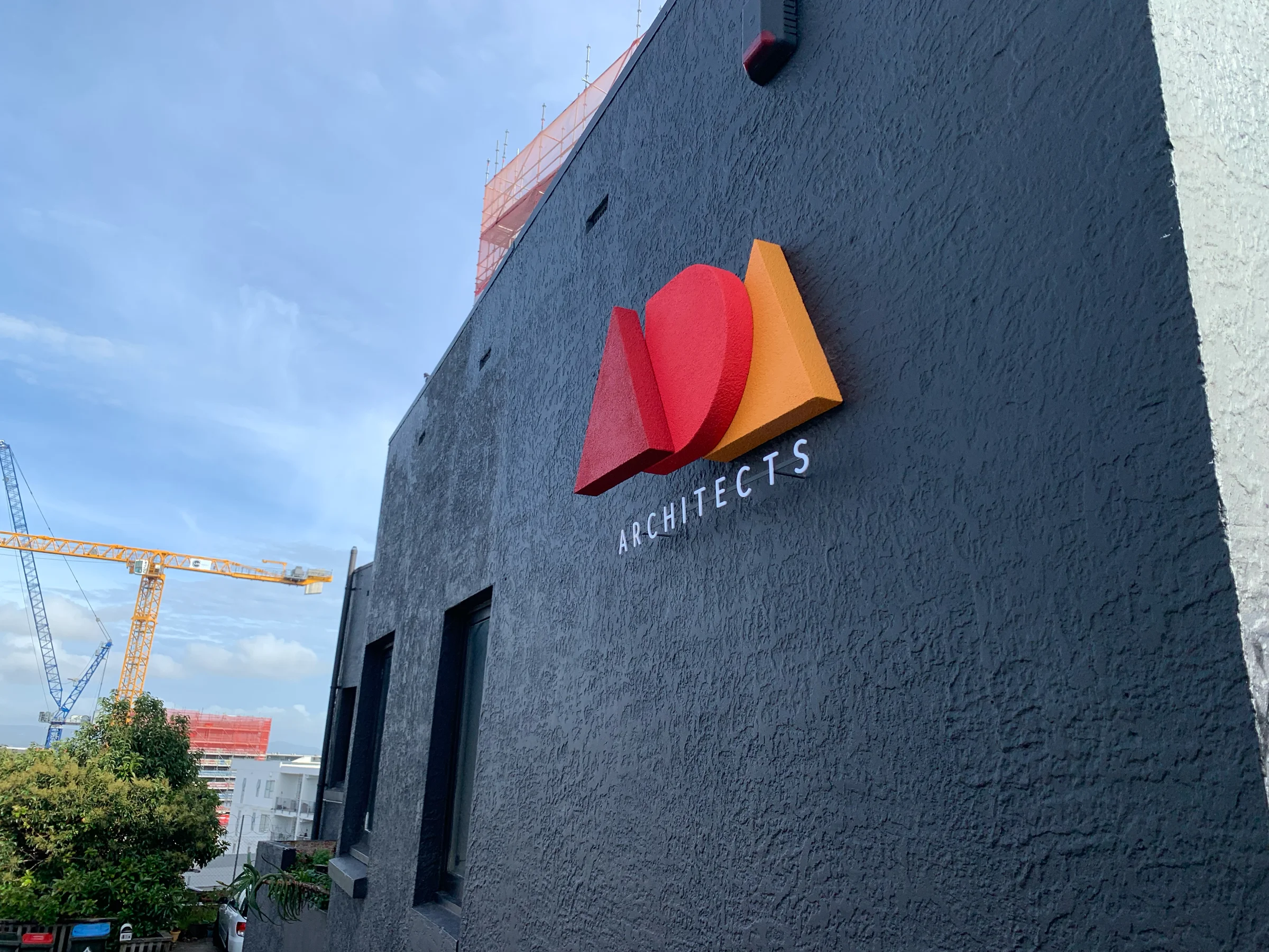
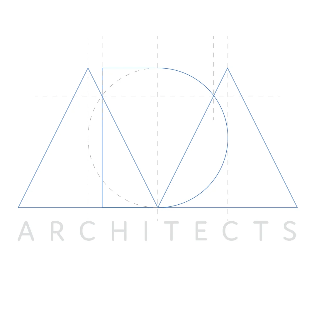
When I designed the branding for Anthony Davis Architects (ADA), I always pictured the logo as a three-dimensional object. I wanted to use the archetypal geometric forms of circle, square and triangle, which suited the letters ADA perfectly. Tony understood the thinking straight away, so convincing him he needed a three-dimensional version of his logo on the side of his building was an easy sell. I originally planned to make the three shapes from reinforced pumice concrete, using a mix I’d formulated when building my pizza oven. I abandoned that idea once I worked out each shape would weigh at least 8 kg, too much for the cantilever to support. We switched to polystyrene with a coarse render, which meant the anchoring rods could be hidden and the drama of the cantilever kept intact. Technically it’s a design piece rather than art, but I figure that if you see the three forms as abstract shapes rather than letters, it counts as art. You can see it on the side of Tony’s building at 47 Mt Eden Road, Auckland.
The thinking
from the planningTurn the flat logo into an object without losing the logo. Seen straight on, the three shapes must line up into ADA exactly as they appear on Tony’s business card. From the street, at an angle, they should separate into a stack of solid geometric forms that seem to hang off the wall with no visible means of support. Let the sun do the rest: as it moves across the building, the shadows between the layers keep redrawing the sign.
- Dramatic cantileverWith each shape 80 mm deep, the front shape floats 160 mm off the wall. The fixings are hidden in the overlaps and other unseen areas.
- Solid appearanceThe depth of the shapes and a coarse textured render give the form a massive, solid look.
- An alternative wire versionA second version drawn with a single continuous, unbroken wire.
Photos and video
the real piece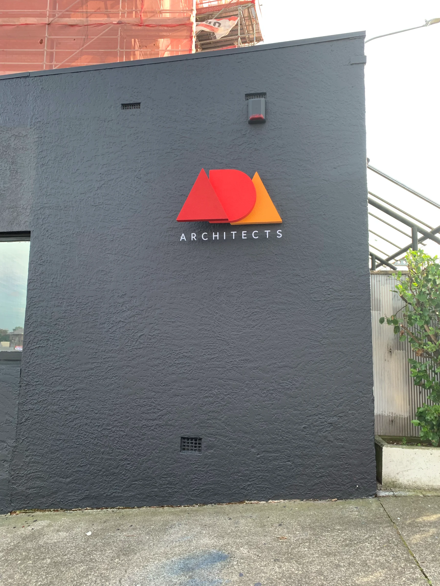

Further thoughts
Of all the branding work I’ve done over the years, my three most satisfying projects have all been for architects. I think it’s because they work in design themselves. They trust a professional and see the value in letting them get on with the job they’ve been hired to do. Whatever the reason, I’m glad Tony agreed to the sign and could see the value in it.
I also really enjoyed how collaborative the project was. I worked closely with the people who formed the shapes, applied the render and helped with the installation. The key was making sure they understood what I was trying to achieve. Once they did, and were on board, they were far more likely to offer genuine expert advice than the usual “I wouldn’t do it like that if I were you.”
This project was a great example of client, designer and contractors all working in sync.
Updates
All updates →No updates yet.
Ask a question or leave a comment
Rather write privately? Email hello@pkm.nz